Data Visualization Narrative / Information Design Visual Design Motion Design Interaction Design

Twenty years of the Sensex, told as a story

A narrative, interactive visualization that turned five tangled economic datasets into one comprehensible story about the sensitivity of the Indian stock market — recognized at IEEE EuroVis and IndiaHCI.

My role
Researcher & Designer
Timeline
4 weeks
Context
NID · Guides: Chakradhar Saswade, Dr. Aneesha Sharma
Tools
Excel, R, Illustrator, After Effects
What kind of design this was

Data visualization & narrative information design

This was data visualization and narrative information design at its core — structuring multi-variable, multi-decade data into a guided story — combining visual design (colour, annotation, chart craft), motion design (an animated prototype), and interaction design (a hybrid author-driven / reader-driven slideshow that lets users explore mid-narrative).

Objective & approach

Make a complex economic story easy to follow and remember

The objective was to understand the sensitivity of the Indian stock market (the Sensex) and communicate it in an easy, comprehensive flow. I adopted a narrative and interactive visualization approach to explain a complex topic by telling stories through datasets that are otherwise difficult to comprehend — adding information hierarchy that reduces cognitive load on the user.

While reading one of P. Sainath's books on poverty in rural India, I hypothesized that there might be a relationship between national events and the country's economic index. I gathered all the datasets — two decades of Sensex values, sectoral indices, GDP annual growth, FDI inflow rate, and non-economic events in India — then mined and munged the data, built line charts in R and Excel, and imported them into Illustrator to add colour, icons and annotations. For the events, I searched the news for each date to relate it to a rise or fall in the Sensex. Finally I prototyped the visualization in After Effects. In the end, I do see the correlation between events and the Sensex value, and how it impacts the value of the Indian Rupee.

Hypothesis to prove: How sensitive is the Indian stock market?
Process

From raw datasets to a designed narrative

Data processed. After collecting data from various sources, the main challenge was to find meaningful signal in the large datasets, weave a core narrative, and communicate it.

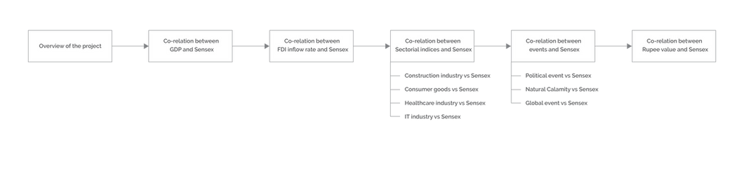
Narrative structure. Following the classic narrative arc of storytelling, I narrated the data to make it engaging and memorable, choosing a comparison style of narration for impact.

Visual narrative genre & information architecture. The Interactive Slideshow structure follows a typical slideshow format but incorporates interaction mid-narrative within each slide — letting users explore particular points before moving on. This balances author-driven and reader-driven approaches.

Visual explorations. Taking inspiration from the intensity of the topic, I chose a greyscale palette and the line chart as the chart type, since the focus is comparison of data and how it changes over time (trendlines).

Storytelling affordances. These are the features of a visualization that provide narrative structure and guide the reader — tying facts and events into a cohesive structure so a slideshow can be read effortlessly while carrying a lot of information.

Narrative structure
Narrative arc / structure
Visual narrative genre
Interactive-slideshow genre
Narrative flow
Narrative flow across the story
Final outcome

The interactive narrative

The visualization opens by briefing the user about the Indian stock market and its economic index (the Sensex). As the user clicks forward, the narrative unfolds through linked comparisons:

  • GDP annual rate vs Sensex — as the Sensex rose, so did GDP, suggesting Indians benefited from the forces driving market growth.
  • FDI net inflow vs Sensex — capital inflow/outflow marks economic growth; Foreign Direct Investment is a major contributor, so rising inflows lift the index.
  • Sectoral indices vs Sensex — capital inflow accumulates across individual sectors; Construction, Consumer packaged goods, Healthcare and IT saw surprising transitions (sectoral indices begin in 1999).
  • Occurrences of events vs Sensex — non-economic events (political changes, war, riots, deaths, natural calamities, global events) are negatively correlated with the Sensex.
  • Indian Rupee value vs Sensex — large foreign-fund inflows create demand for the Rupee; the RBI pumps Rupees into the market, leading to inflation where too much money chases too few goods.

I ended the explanatory visualization with an open-ended question — to make the story more impactful, memorable and thought-provoking, and to encourage people to participate, learn, and make informed decisions: "Have Indians actually benefitted from the reasons that brought about the growth in the stock market? Is the Sensex an economic index or an opportunistic index?"

Final interactive narrative
The final interactive narrative — landing
GDP vs Sensex
GDP growth mapped against the Sensex
Events vs Sensex
Non-economic events plotted against market movement

Video prototype

Challenges faced

Honest design tensions

Interaction vs the story arc

Interactive stories interfere with the narrative arc; striking a balance between focus and interaction was difficult.

Making it memorable

Finding the elements that make a visualization unique and memorable — combining qualitative and quantitative data.

Data values, not just structure

A story's effectiveness depends not only on data structure but on the actual values that generate the pattern.

Measuring effectiveness

Measuring impact through engagement and interest, recall of key points, and the ability to make an informed decision.

My responsibilities & artifacts

What I owned as the designer

Design responsibilities
  • Sourced, mined & cleaned five datasets across two decades (R, Excel)
  • Built the narrative arc and information architecture
  • Designed the hybrid author-driven / reader-driven interaction
  • Crafted the visual system (greyscale, line charts, annotation, icons)
  • Produced the animated motion prototype (After Effects)
Artifacts delivered
  • Cleaned, integrated multi-source dataset
  • Narrative-flow & site-flow diagrams
  • Storytelling-affordance framework
  • Interactive narrative visualization (5 linked comparisons)
  • Animated video prototype
Impact as a designer

Recognized internationally

← Previous: Open Budgets India Next: Blood-bank system →