Data Visualization Visual / Metaphor Design Interaction Design Narrative Design Motion Design

The Forever 27 Club: data as empathy

An exploratory, metaphor-driven visualization that turned a dataset of musicians' early deaths into a reflective, awareness-building experience — designed so people discover their own stories in the data.

My role
Researcher & Designer
Timeline
4 weeks
Context
NID · Guides: Chakradhar Saswade, Dr. Aneesha Sharma
Tools
Excel, Illustrator, After Effects, Photoshop
This project touches a sensitive topic — substance use and early death. It was designed to build empathy and awareness, not to sensationalize.
What kind of design this was

Exploratory data visualization & metaphor-led visual design

This was exploratory data visualization combined with metaphor-led visual design — choosing a vinyl-record visual language so the form itself carries the subject's emotional weight — delivered through reader-driven interaction design (filtering and drill-down) and a motion prototype.

Objective & approach

Make people feel the human story behind the data

While exploring socially-stigmatized topics like depression, I stumbled on the "27 Club" — popular musicians who died at age 27, often as a result of drug and alcohol abuse, or violent means such as homicide or suicide. The number of musicians who died at this age, and the circumstances of those deaths, gave rise to the idea that premature death at 27 is unusually common. Although humans die at all ages, there is a statistical spike for musicians who die at 27.

The main challenge was to hold two contrasting truths at once: lives that were glorified, yet tragically short-lived. The main goal was to make users find their own stories through the data and to create awareness among a large user base. I adopted an exploratory interactive visualization with a drill-down story approach, choosing graphics with a deliberate connection to the narrative to build more empathy.

Reason: I wanted to make an exploratory visualization from narrative events.

Process

From moodboard to metaphor

Data mapping. The available data types were causes of death, year of death, genre types, artist types, track records, and artists. Except for track records, all were categorical (qualitative) — so the visual encoding took a metaphorical approach rather than the usual styles.

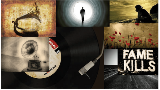
Moodboard. I collected and arranged images in a similar theme to establish the visual language for the visualization.

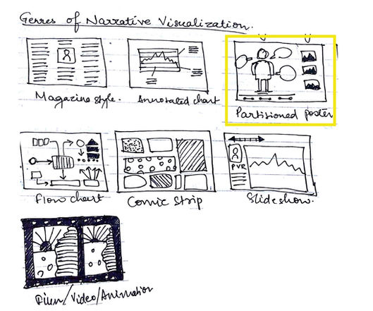
Genre of narrative visualization. I followed a partitioned-poster style with single-frame interactivity after the user clicks the introduction page. The page splits into two sections: one with the vinyl disc, the other a gramophone panel and summary.

Visual explorations. The platform stays very consistent even without a strict ordering of events. The colour schemes follow the vinyl disc and are consistent across pages. I tried other timeline designs — linear flow, vertical flow — but ultimately the metaphorical approach with stories about the artists was given more importance, because it built more empathy.

Narrative structure. The narrative comes through the interaction of text in the left section with annotation and graphic elements in the right panel — multi-messaging. The right panel shows artist names in bold with genre and instruments as sub-heading, making a vast quantity of information into memorable factoids, followed by a brief description of the death and glory of each artist. To make it interactive, genre and artist types appear as a checklist where users play and find their own insights.

Data mapping
Data mapping & encoding approach
Moodboard
Moodboard — establishing the visual language
Narrative arc
Narrative arc & partitioned-poster structure
Genre of narrative viz
Partitioned-poster genre & layout
Visual exploration
Visual exploration & metaphor development
Final outcome

The vinyl-record visualization

The landing screen loads with the disc rotating by default, listing each artist's details in the right panel as they align to the header. The continuous rotation acts as a starting point for the personal experience of the data and provides a tacit tutorial for the user.

Interaction using filters. Data is not presented all at once but constructed hierarchically with annotation and animation. Selecting a filter displays the relevant artists' names on the disc; on hover, it reveals the cause or year of death.

Different views for the dataset. Two arrangements are possible — by default, by cause of death; the user can re-arrange by year of death. This emphasises the reader-driven approach, letting users dictate what stories are told and when — though it still required significant authoring to determine possible interactions, which stories to include, and the detail for each.

Vinyl record landing
Vinyl-record interface — the landing view

Video prototype

My responsibilities & artifacts

What I owned as the designer

Design responsibilities
  • Sourced & structured the dataset of artists who died at 27
  • Designed the metaphorical visual language (vinyl / gramophone)
  • Built the moodboard & partitioned-poster layout
  • Designed reader-driven interaction (filters, hover, drill-down)
  • Authored the narrative & factoid content
  • Produced the animated motion prototype
Artifacts delivered
  • Structured dataset & data-mapping
  • Moodboard & visual-language system
  • Interactive vinyl-record visualization
  • Filter / re-arrangement views (cause & year)
  • Animated video prototype
Impact as a designer

Affective, empathy-first visualization

← Previous: Blood-bank system All work →