An end-to-end redesign of 1mg's "Ask a Doctor" online-consultation experience — reconnecting a fragmented patient–doctor journey into one seamless care loop, from research through shipped, high-fidelity product.
The work spanned the full product-design stack. At its core it was service design — repairing the broken handoffs between consultation, pharmacy, and labs across a two-sided ecosystem — delivered through interaction design (user flows, information architecture, wireframes, and high-fidelity UI for both a patient app and a doctor app) and conversational UX (the in-chat e-prescription). All of it was anchored by mixed-methods UX research and validated through field usability testing.
Reconnecting the consult ecosystem meant solving three things that any modern healthcare-AI product still has to get right: getting both sides onboarded with almost no friction, letting people and automation work as one team with the human in command, and giving patients real control over the recommendations they receive.
A two-sided product only works if both sides can start with almost no learning curve, so I redesigned onboarding for the doctor and the patient.
Doctors had been avoiding the e-prescription feature because issuing an Rx inside a chat was slow and error-prone. A card-sorted IA, a guided "write your first prescription" flow, inline medicine/lab parameters, a preview before sending, and a collapsed view after each item let a clinician go from sign-in to a correct, sent prescription on their first try.
Patients got a rebuilt consult landing experience — clear service information and entry points for first-time users, past consultations surfaced for returning ones — refined across twelve wireframe iterations. Guerrilla usability with elderly, first-time users (a critical non-user group) drove reduced choice overload, step-by-step guidance, and real doctor photos over icons, so even a non-tech-savvy patient could begin a consultation with confidence.
The e-consultation ecosystem already pairs people with automation, and I designed those touchpoints so the human always stays in control: a symptom checker triages a patient before a doctor is engaged, and on the doctor side every system-assisted e-prescription is previewed, editable, and approved before it ever reaches the patient — collaboration, never a black box.
The same pattern points to where the ecosystem goes next: clinical and front-desk staff working alongside assistants that draft a prescription, summarise a consult, suggest a lab booking, or pre-fill a follow-up — each surfaced as a reviewable draft with clear provenance, a confidence signal, and one-tap accept / edit / reject, so staff stay confidently in command while the routine work is handled for them.
Proposed pattern: the AI co-worker surfaces its work as a reviewable draft — provenance, a confidence signal, and one-tap accept / edit / reject keep clinical staff in command.
A prescription is a system-generated recommendation, so I designed the patient e-prescription to be transparent, editable, and refusable rather than something simply handed down:
The principle — the person decides what they act on — is the same one I later studied directly in my research on human–AI trust and control in the multi-agent belonging case study.
The product I worked on is "Ask a Doctor", 1mg's online doctor-consultation vertical. The major problem we set out to solve: a patient couldn't use their consultation to actually buy prescribed medicines or book the recommended lab tests. That limited the experience to just talking to a doctor — leaving the whole e-consultation ecosystem fragmented. The aim was to enhance the overall experience of online consulting and make it as seamless as possible across all of 1mg's verticals.
About 1mg. 1mg is India's leading consumer health platform. It aspires to be the trusted health partner for all Indians, with a mission to make healthcare accessible, understandable and affordable for a billion Indians — enabling consumers to learn more about their medicines and find more cost-effective substitutes.
Reason I took it on: a genuine interest in healthcare data and the possibility of meaningful digital intervention in this space.
Online consultation was a dead end. Patients consulted, then dropped off because they couldn't act on the advice. Doctors, meanwhile, found issuing a usable digital prescription slow, confusing, and error-prone — so they avoided the very feature that would complete the loop. Every broken handoff was both a care failure and lost cross-sell into pharmacy and labs.
I followed the double-diamond problem–solution approach to define the real problems faced by 1mg's users, through extensive user interviews, surveys, and field visits to nearby hospitals, clinics, doctors, and patients for richer contextual inquiry. The qualitative process included:
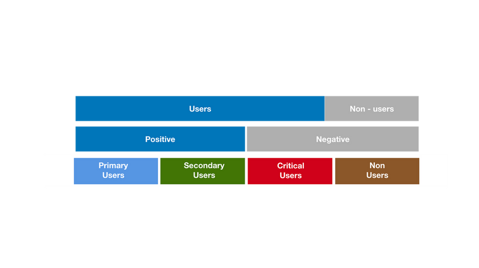
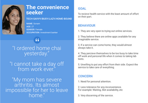
This synthesized into 11 personas across primary, secondary, critical, and non-user groups.


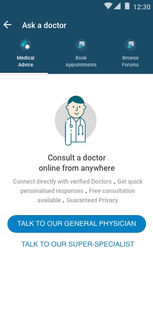
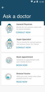
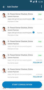
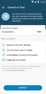
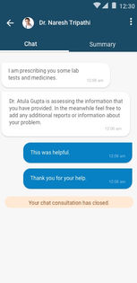
Before mapping user tasks, I re-interviewed users to understand: the pain points of using the e-consult service; reasons for using existing platforms; beliefs, fears, expectations and attitudes toward remote and tele-consultation; the perceived difference between physical and online consultation; and the problems faced by both doctors and patients in each phase of consultation.
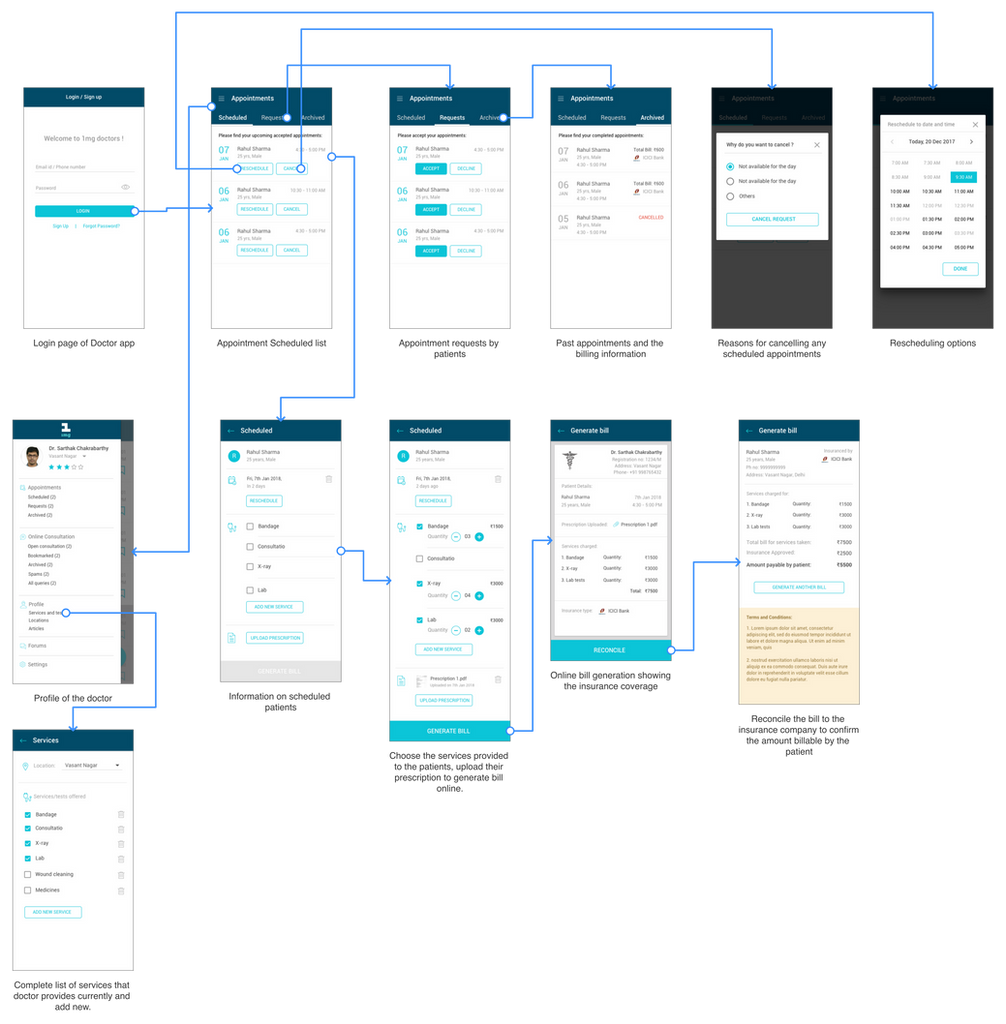
I mapped the competitive landscape of online patient–doctor consultation platforms, then built a patient journey map across the phases of online consultation — actions per phase, features, gaps and opportunities, suggested design interventions, and a mood indicator. This located precisely where the experience broke and narrowed the work to a redesign of both the patient and doctor apps.


The sharp drop-off was the inability to act on advice — buy meds, book labs — not the conversation itself.
Issuing an e-prescription in chat was slow and confusing, so doctors avoided it — starving the feature that completes the loop.
Field testing found choice overload, a need for step-by-step guidance, and distrust of icon-only doctor avatars.
The redesign had to serve five patient types: premium (paid), free (non-paid), users seeking a second opinion, users with multiple-speciality problems, and novice users who had never experienced remote consultation. Based on the pain points, gaps and opportunities, I finalised these features for the patient app:
Using card sorting, I defined the architecture of the redesigned patient app — establishing how onboarding, services, consultations and history fit together.


The e-consult landing page had to surface: an entry to appointment booking; an entry to forums; service information for first-time users; buttons for Ask Doctor, Ask Super-specialist, and Symptom Checker with details; omni-channel communication; past consultations for returning users; and a start-new-consultation button. I worked through twelve wireframe iterations to balance all of this.


In the final design, the specialists and their detailed information are displayed before the conversation starts, to aid better decision-making by the patient. The entry point to audio consultation is introduced after a chat consultation begins, in case the patient chose chat from the initial list of services.


A patient couldn't use a consultation to buy prescription medicines online, which limited the experience to "just consulting." On the doctor side, issuing an online prescription inside a chat was difficult, time-consuming, and often confusing for patients to decipher. The e-prescription feature cross-integrates with the pharmacy and labs verticals so the user's task flow through e-consultation is seamless and complete.
The doctor flow lets a doctor: write a new Rx or check past ones; see patient details; prescribe lab tests and medicines (choosing medicine parameters while adding); add follow-up information; preview before sending; and use a collapsed view after adding a medicine.

Once sent, the e-prescription appears in the patient's chat interface, letting them directly order medicines or lab tests — completing the ecosystem of patient care. Patients can: select/deselect prescribed lab tests to order; view prescribed medicines with dosage instructions and check availability without opening the e-Rx; view the full e-Rx; track lab-test status in chat; and share or download the prescription for future use (with doctor details, patient details, medicine list and dosage, investigative tests and follow-ups, lifestyle/diet instructions, and a disclaimer noting the Rx was issued online without a physical check-up).


On the doctor side, the booking feature lets a doctor: generate the patient's bill online from a booked appointment (handling the insurance part of services); add the services they provide so patients can see them while booking; accept or decline requests (with a required reason on decline); reschedule or cancel appointments (with a required reason on cancellation); and track patients' past records and generated bills.

I ran a guerrilla study to assess the accessibility of the new e-consultation login, targeting elderly adults — a critical, largely non-user demographic. The focus was ease of navigation, clarity of instructions, button accessibility, and overall experience.
Note: due to some constraints, the full usage and revenue stats couldn't be documented online — happy to discuss them offline.